
Twentieth century color notation systems emerged and evolved to assist with identifying, communicating and applying color from design conceptualization through to final outcomes and production across applied design and design of the built environment.
Color systems and charts emerged across different sectors including painting, entomology, dyeing, horticulture, or philately, and were used as visual resources by naturalists, painters, printers, collectors, and dyers. Color samples were used for identification purposes or to ensure a level of color accuracy and consistency across purpose-driven activities. Check out early color systems via this link.
Despite obvious differences, early color notation systems provided a conceptual basis for contemporary systems such as NCS and Pantone. This survey is not exhaustive but features key systems that provide an indication of the format, range of colors, and applications of amateur and commercial color notation systems.
While multiple color systems have been developed, the Smithsonian Institution notes that “color remains elusive to scientists and color experts, who have yet to discover a truly uniform color model” (SI, 2017). Hence, color matching across different modern color systems continues to be problematic due to ontological differences between systems while the Hex system provides the closest system to provide cross color identification between and among systems.
The image featured is a restored version of an original page from the Atlas of the Munsell Color System, 1915. The image was restored in June 2023 by Zena O'Connor and can be downloaded and reproduced with permission and appropriate attribution. Contact: zena@zenaoconnor.com.au
Société Française des Chrysanthémistes (1905)
The Société Française des Chrysanthémistes published two editions of ‘Répertoire de couleurs pour aider à la détermination des couleurs des fleurs, des feuillages et des fruits’ [A directory of colors to identify flowers, foliage and fruit] in collaboration with René Oberthür and Henri Dauthenay.
The text features 1,451 color samples in total – the 1st edition features 179 colors in 4 variations plus 17 metallic/other colors (733 color samples). The 2nd edition features 178 colors in 4 variations plus 5 metallic/other colors (718 color samples). Each color sample is accompanied by origin and pigment name (4 languages). In addition, the 1st edition features illustrations related to traditional color theory including a hue circle plus a very effective illustration of simultaneous contrast.
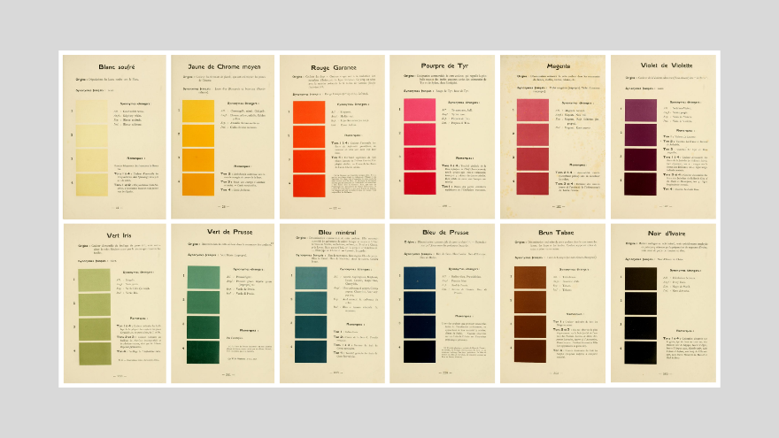
Figure 1. Pages from ‘Répertoire de Couleurs’, 1905. (Image: archive.org)
Nouveau Larousse illustré (1906)
Devised by Pierre Larousse (1817-1874), the Nouveau Larousse Illustré was an encyclopaedia published between 1897 and 1904 in 7 volumes and a supplement. Later volumes were updated and written in a neutral, scientific style under the editorship of Claude Augé (1854−1924).
The Supplement to the 1898 edition includes two pages that relate to color feature one chart devoted to colors used by artists and painters (Couleurs employees dans la peinture artistique) which focuses on RYB color. A second chart features colors used in industry, textile manufacture and dyeing (Principales couleurs employees dans la peinture industrielle).
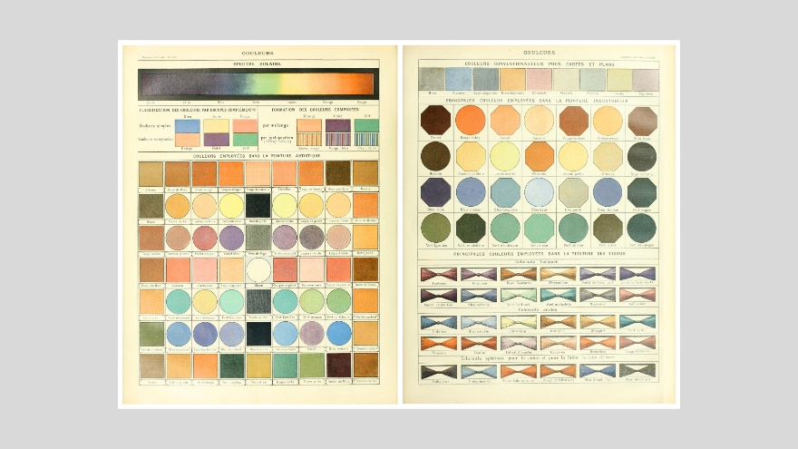
Figure 2. Color pages from Nouveau Larousse illustré (1906)
Jorgensen (1906)
‘The mastery of color. A simple and perfect color system, based upon the spectral colors, for educational and practical use in the Arts and Crafts’ (1906), a self-published text by Charles Julius Jorgensen, is mentioned by Ridgway (1886).
Little is known about this text except that it’s color theories and extant illustrations reflect similarities with those commonly found in color curriculum in design schools in the early to mid-twentieth century. The text was accompanied by a series of illustrations plus a perforated mask plate which could be used to identify a series of nine colors.
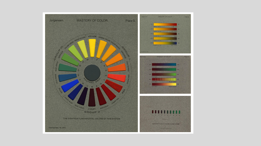
Figure 3. Color charts, Jorgensen, 1906 (Image source: archive.org).
Klincksieck & Valette (1908)
Eighteen years after the death of Michel Eugène Chevreul (1786-1889), Paul Klincksieck (1857-1909) and Theodore Valette sought to simplify and abbreviate Chevreul’s theories about color and present them accompanied by full-color illustrations specifically for artists and those involved in commerce and industry. From the publishing house Éditions Klincksieck founded in 1842, Klincksieck worked with Valette (dye master at Gobelins where Chevreul was previously dye master) to create a ‘Code of Colors’ for use by naturalists, artists, and those working in commerce and industry. Klincksieck and Valette discuss RYB color and how red, yellow, and blue (les trois couleurs simples, le bleu, le jaune et le rouge) can be used to generate countless color nuances, 720 of which are featured in the text.
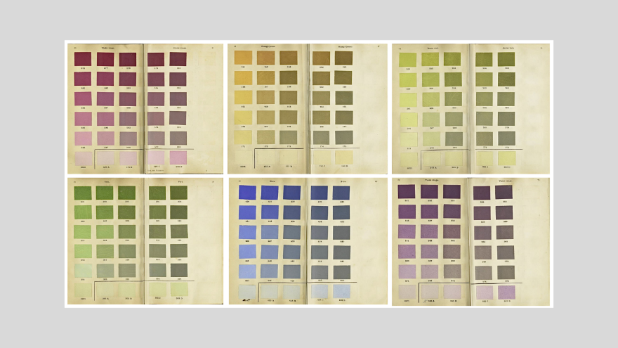
Figure 4. Pages from Klincksieck & Valette, 1908. (Image source: archive.org).
Ridgway’s Nomenclature of colors (1912)
Robert Ridgway (1850-1929) was an American ornithologist who was appointed in 1880 by the secretary of the Smithsonian Institution to be the first full-time curator of birds at the United States National Museum.
Ridgway published multiple texts including two that related specifically to color with the aim to create "a nomenclature of colors and a compendious dictionary of technical terms used in descriptive ornithology, together with a series of plates or diagrams illustrating the external anatomy of a bird in relation to the terms employed, and such other things as are more clearly expressed by a picture than by a mere definition” (Ridgway, 1912,p14).
In creating his nomenclature, Ridgway included multiple pages devoted to lists of pigment colors including a vocabulary of color names in English, Latin, German, French, Spanish, Italian, Norwegian and Danish plus multiple pages of technical information. In addition, Ridgway’s text features ten color illustrations plus directions to create specified pigment colors, such as "Indigo blue . . . Antwerp blue + black" (Ridgway, Plate XI). Colors in the text are variable in quality and vary across different editions of the same text.
Ridgway’s self-published ‘Color standards and color nomenclature’ (1912) became a highly influential, reliable, and widely used color reference for good reason. The text featured 1,115 colors illustrated via twenty-seven painted samples on 53 plates. Ridgway notes, "In the present work the possibility of variation between different copies is wholly eliminated ... Each color, for the entire edition, is painted uniformly on large sheets of paper from a single mixture of pigments, these sheets being then cut into small squares which represent the colors on the plates" (Ridgway, 1912, p13). The text presents as an excellent color standard manual due to its quality of production, thanks to the entrepreneurial Ridgway.
In Ridgway’s text, colors are clustered by hue similarity and each page features variations in tone and saturation of each hue in an orderly layout accompanied by color pigment name.
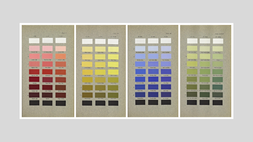
Figure 5. Four pages from Ridgway, 1912 (Image: archive.org).
Baumann & Prase (1912, 1922)
Paul Baumann (1869-1961) founded his company in 1912 in Aue, Erzgebirge, Germany with Otto Prase (1874-1956). Baumann had previously manufactured and supplied color cards and charts for industry and Prase had developed a color theory with instructions for mixing pigments, for which he was awarded multiple gold and silver medals at trade fairs (1905 Munich, 1913, 1924 and 1928 Leipzig, 1926 Zeitz and 1926 Zittau). On behalf of the Deutscher Werkbund, Prase supplied ‘for industrial use the best available tool for these purposes for industry, trade and craft’. Prase and Ostwald crossed paths before the outbreak of World War I in 1915; however, they did not collaborate.
Baumann and Prase published ‘Baumanns Neue Farbentonkarte, System Prase’ (Baumann's New Color Tone Card, System Prase) in 1912, which was based on Prase’s color system featuring three primary colors red, yellow, and blue, the respective intensity of which is expressed in a number between 0 and 9. Prase initially featured 24 main hues and a 14-step grey scale with white (1) and black (14). From 1935 onwards, subsequent color charts featured 48 key colors.
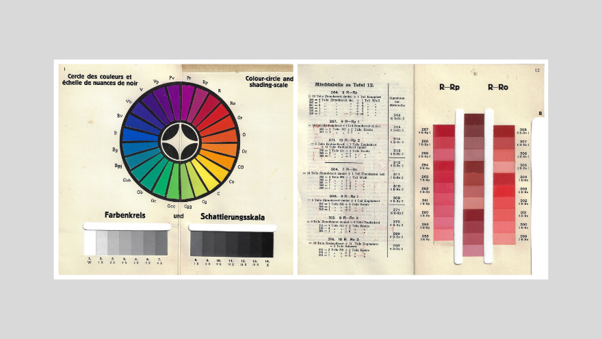
Figure 6. Illustrations from Baumann and Prase, 1912 (Image: archive.org).
In 1922, Prase and Baumann published multiple editions of the color atlas and color fans. The second edition of the color system, which was updated by Prase to include twelve bronze tones, contained 1,359 color nuances. The color charts were intended for use by painters, designers creating visual imagery for applied design, and related industry purposes. Prase also developed a thousand-piece color cube model (1945) which was produced by Baumann. Other titles published by Baumann include Das deutsche Farbenbuch I-III (1925/26), Neuer Farbenatlas (1922) and Der Farbenfächer (1924). It is likely that Baumann and Prase’s contributions to color theory and charts were interrupted by World War II and after in light of the bombing of Dresden and surrounding areas during the war.
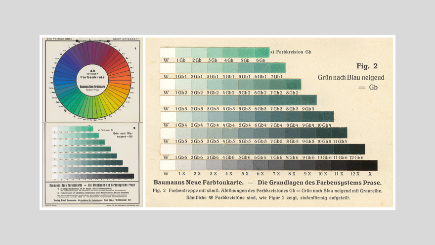
Figure 7. Illustrations from Baumann and Prase, 1922 (Image: archive.org).
Munsell (1905, 1915)
American painter and art teacher at the Boston Normal Art School (now Massachusetts College of Art and Design) in the late 19th century, Albert Henry Munsell (1858-1918) believed that a practical theory and notation of color did not exist. In time, Munsell secured patents at the United States Patents and Trademarks Office for a spherical color model on January 9, 1900 (Patent 640,792) and a color chart (scale) on June 26, 1906 (Patent 824,374) (USPTO, 2023).
Munsell subsequently published A Color Notation (1905), in which he described a color system that exhibited decimal notations and identified color by hue, value and chroma, illustrated in the ‘Atlas of the Munsell Color System’ (1915).
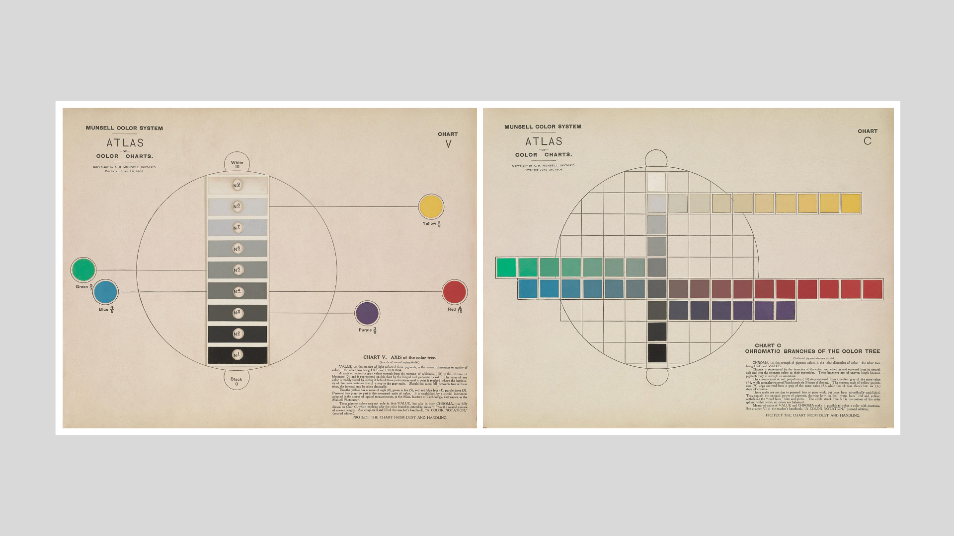
Figure 8. Pages from the Atlas of the Munsell Color System, 1915 (Image: archive.org).
Munsell determined that every color sensation may be measured and defined by three color attributes: hue, value, and chroma. In the ‘Atlas of the Munsell Color System’, which was underpinned by the decimal system. Munsell’s grayscale featured white (0) at the top of a vertical pole with nine steps of gray down to black (10) at bottom of the vertical pole (see Chart V, Atlas of the Munsell Color System, 1915).
Munsell identified five key colors (red, yellow, green, blue, purple) broken down as follows:
The scale of hue is a sequence of red (R), yellow-red (YR), yellow (Y), green-yellow (GY), green (G), blue-green (BG), blue (B), purple-blue (PB), purple (P), and red-purple (RP). The five principal hues melt perceptibly into intermediates by ten steps, of which the middle or fifth step is typical of that hue. The scale of values is also decimal from 0 (black) to 1 0 (white), and the scale of chromas likewise from 0 (neutral gray) to 1 0 (the strongest permanent pigment so far obtained) (Munsell, 1915, p1).
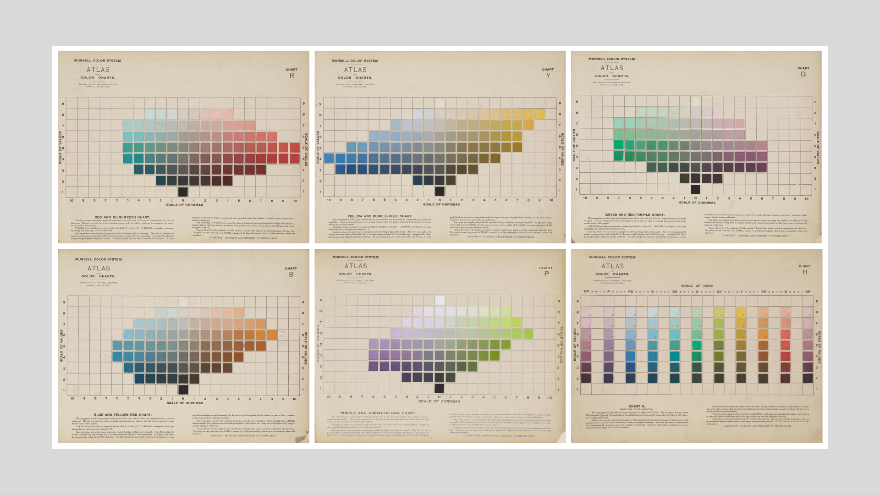
Figure 9. Pages from the Atlas of the Munsell Color System, 1915 (Image: archive.org).
Munsell color notation protocols involve three numbers that relate to hue, value and chroma – in that order. Hue is based on ten hue sectors as per the Munsell hue circle.
Munsell Value is represented by the numerals in between 0 (black) through to 10 (white).
Chroma is identified on a scale, typically in the range of 2 to 14. A level of 0 is a total lack of chroma and 14is full intensity chroma, with some fluorescent colors tracking up to 30. Munsell 5Y 8.5/14 – represents Munsell yellow at tonal value of 8.5 and chroma level 14.

Figure 10. Pages from the Atlas of the Munsell Color System, 1915 (Image: archive.org).
A drawback of the Munsell color system when it was initially published was that, like the Ostwald color system, it lacked the capacity to extend and expand, and allow for color nuances between contrasting or non-aligned hues aside from greyed hues.
The Munsell Color Company continues to provide a range of proprietary products and the Munsell Color Science Laboratory, which is part of the Rochester Institute of Technology in New York, offers Master of Science and PhD color science degrees. The proprietary products offered by Munsell Color Company include color communication products, color standard products and educational products which feature colored chips notated using the Munsell color system. In 2006, the Munsell Color Company became a subsidiary of the X-Rite Inc., which also acquired Pantone in 2007 (https://www.xrite.com/page/our-brands).
Ostwald (1916, 1918, 1921)
Wilhelm Ostwald (1853-1942) won the Nobel Prize for Chemistry in 1909 and focused on color after his retirement. In 1914, he was given the task by the Deutsche Werkbund to develop a ‘rational color atlas’ to satisfy industry need for a standardized system and nomenclature of colors (Schawelka, 2018, p13). At the time, Germany held the lead on world production of new synthetic colours and the textile industry among other industrial sectors needed clear, unambiguous color designations. However, creating a color atlas is problematic, requiring a balance between scientific exactness and pragmatic feasibility.
Ostwald’s ideas about color drew on the earlier theories of Ewald Hering, whose work influenced the development of the NCS color notation system (Feisner, 2000; Gage, 1995; Granville, 1994). In 1916, Ostwald published the results of his color investigations: ‘Die Farbenfibel’ (The color primer), which contains the basic principles for the production of a colour atlas. A successful publication, it was translated into English in 1917 and achieved 14 editions by 1930.
In developing his color atlas, Ostwald conceptualized a double cone-shaped color model with four primary colors: red, yellow, green, and blue plus white and black which featured at the top and bottom of the color model. Ostwald’s model was built on an eight-by-eight grid with eight steps from white through to black (central core) and eight steps from full saturation to desaturated color towards the central core.
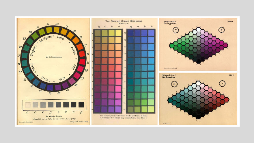
Figure 11. Ostwald’s color model, 1918 (Image: Granville, Encyclopedia Britannica).
In 1917, Ostwald published his first colour atlas with 2500 colours (later reduced in size to 680 colours). In 1918, he published ‘Harmonielehre’ (Colour harmony manual).
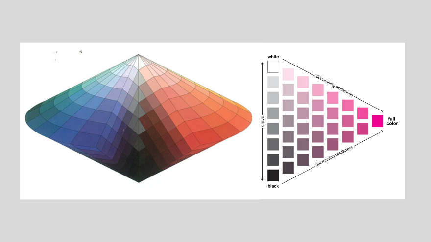
Figure 12. Ostwald color illustrations, 1916 (Images: archive.org & wilhelm-ostwald-park.de).
Ostwald’s approach to colour harmony was strict and prescriptive: “Harmony = order” and he suggested that harmony is achieved through a proportional combination of colors clustered by similarity. Ostwald declared: “Neatly spaced intervals will lead to harmony either among pure hues or among equal-white or equal-black colors found on equal value circle” and “the simpler the order, the more illuminating or convincing is the harmony” (Ostwald, 1917/1969, p65-67).
Ostwald’s quantitative determinations about color and highly prescriptive declarations about color harmony caused alarm among artists, art historians and color theorists at the time including Adolf Hölzel, Johannes Itten, Paul Klee, Oskar Schlemmer, Edwin Redslob, Paul F. Schmidt, and Hans Hildebrandt. Ostwald declared, "only such colours can appear harmonically or coherently, whose characteristics show certain simple relations" and provided specific rules for color allocation and achieving color harmony. Many feared that Ostwald’s approach represented ‘painting by numbers’ and essentially rejected his ideas (Schawelka, 2018).
In 1930, Winsor & Newton’s scientific director, John Scott Taylor, translated ‘Die Farbenfibel’ (The Colour Primer) into English, ensuring that the text reached a wider audience. Ostwald delivered several lectures at the Bauhaus before it was closed in 1933 and his system was popular among some artists such as those from the De Stijl group. However, Ostwald’s color system – which was restricted in number and didn’t feature a large gamut of colors plus was difficult to adapt to new dyes and pigments as they became available – was passed over in favour of more widely used systems like the Munsell system and the NCS system (W&N, 2023). In addition, Ostwald’s aesthetico-mathematical, deterministic, and rigid ideas and formulae about color application was superseded by a less deterministic approach as per the theories of Itten and Albers.
Verlag des Schwaneberger (1922)
This text relates specifically to color for stamp collectors and features 121 color samples plus eight achromatic variations of white through grey to black accompanied by color descriptions in German, French and English.
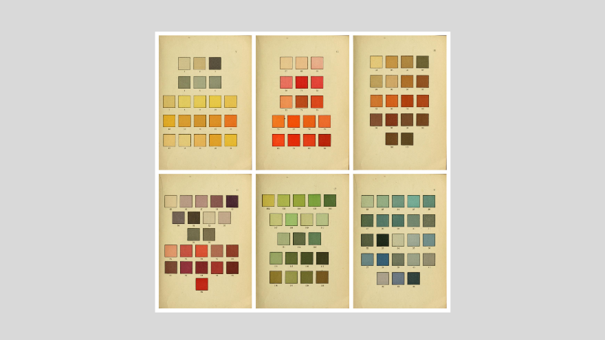
Figure 13. Pages from Verlag des Schwaneberger, 1922 (Images: archive.org)
Color-Aid Corporation (1948)
According to Color-Aid Corporation, the color system was “initially developed as a backdrop for photographers. Color-aid was soon thereafter discovered by Josef Albers and has since then become an indispensable teaching tool in art and design classes. Graphic illustrators, fashion designers, architects, photographers, interior designers, artists, and other creative professionals depend on Color-aid papers for many of their projects….In 1990 the Color-aid system was expanded to 314 colors to meet the demand for brighter colors, a wider range of pastels ("muted" or "soft" colors), and lighter tints” (Color-Aid, 2023).
Patents lodged with the United States Patent Office note that the “Color-Aid swatchbook and booklet (available from Color-Aid Corp., 37 East 18th Street, New York, N.Y.) are based on a classification System similar to the Munsell System.”
Color-aid offers sets of colored sheets and sets of colored cards (220 and 314 colors) plus a larger portfolio of colors. The colored cards are a highly useful educational tool to explore color nuances.
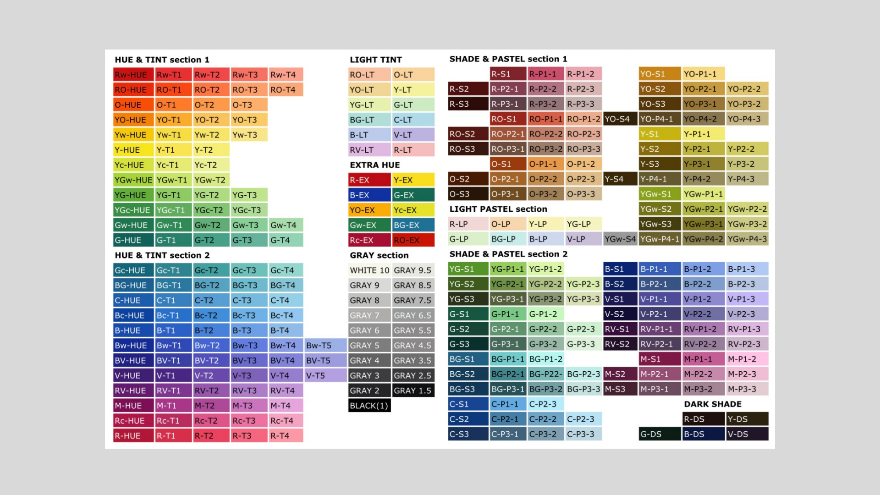
Figure 14. Color samples from the Color-aid Corporation, 2023 (Images: coloraid.com)
Richter DIN 6164 (1953)
The German Institute for Standardization (Deutsches Institut für Normung, DIN), which was founded in 1917, advocated for standardization across multiple areas of industry and manufacture from color data, through to nuts and bolts, and paper sizes. For example, DIN 476 relates to paper sizes (A4, A3, etc) and is now known as ISO 216.
Responsibility for standardization of color was allocated to the German Color Council which then nominated Manfred Richter (1905-1990) to undertake the task. Development of the color system commenced in 1941 with initial results made available in 1953. Richter advises that the official German Standard Color Chart (DIN-Farbenkarte) was intended as a technical resource for practical specification of color. In developing the chart, he aimed for uniformity across the color circle and chart to meet DIN intentions (Richter, 1955; Richter & Witt, 1986).
In the Richter DIN 6164 system, color is arranged according to hue (T), lightness/darkness (D), and saturation (S), with even steps between each color nuance. Richter and his team used a sample group of several hundred people, who viewed different color charts, to determine 24 evenly distributed hues for a color hue circle, with yellow #1, orange #4, red #7, violet #13, blue #17 and green #21. Each hue was defined by a specific wavelength of the spectrum.
Richter used a scale from 0 to 6 for the saturation levels, with full saturation at the outer edge of the hue circle. In respect to lightness/darkness, Richter used a scale of nine steps from 0 (white) through to 10 (black).
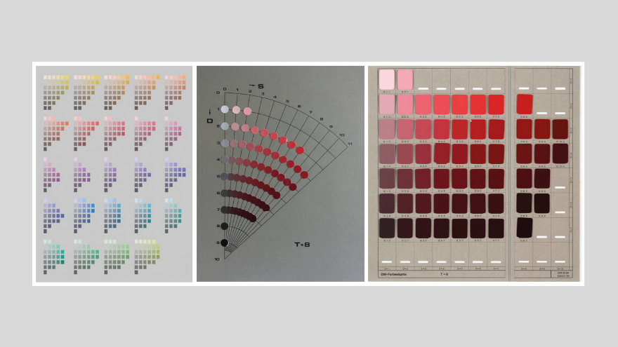
Figure 15. Illustrations, DIN Richter color system (Images: Richter & Witt, TUD)
Update June 15, 2023 © Zena O’Connor PhD – https://zenaoconnor.com
References – Twentieth century color systems
A useful online source for books on color: https://onlinebooks.library.upenn.edu/webbin/book/browse?type=lcsubc&key=Color&c=x
Augé, C. (1906). Nouveau Larousse illustré : Dictionnaire universel encycloedique (Supplement). Paris: Librairie Larousse. Accessed May 12, 2023, from https://archive.org/details/nouveaularoussei00laro/
Baumann, P. (1912). Baumanns Neue Farbentonkarte, System Prase. Aue, Saxony: P. Baumann.
Bendin, E. & Mauersberger, K. (2012). Sammlung Farbenlehre hat neues Studio für Ausstellungen. Dresdner Universitätsjournal, July 2012. Accessed June 4, 2023, from
Budds, D. (2015). How Pantone became the definitive language of color. Fast Company, September 18, 2105. Accessed 20 July 2020 from https://www.fastcompany.com/3050240/how-pantone-became-the-definitive-language-of-color
Jorgensen, C. J. (1906). The Mastery of Color. A simple and perfect color system, based upon the spectral colors, for educational and practical use in the Arts and Crafts. Published by the Author. Milwaukee, 1906. 8vo., 2 vols., one of text, the other of 22 loose colored plates contained in double box. Text accessed on March 16, 2023 from https://library.si.edu/digital-library/book/masterycolor00jorg
Klincksieck, P. & Valette, T. (1908). Code des couleurs: à l'usage des naturalistes, artistes, commerçants et industriels : 720 échantillons de couleurs classés d'après la méthode Chevreul simplifiée. Paris: P. Klincksieck. Accessed on March 20, 2023 https://archive.org/details/gri_c00033125005901604/
Kuehni, R. G. & Schwarz, A. (2008). Color ordered: A survey of color order systems from antiquity to the present. Oxford: Oxford University Press.
Mylonas, D., & MacDonald, L. (2012). Color naming for color communication. InJ. Best (Ed.), Color Design: Theories and Applications, (pp. 254-270). Cambridge,UK: Woodhead Publishing.
Munsell, A. H. (1915). Atlas of the Munsell color system. Boston: Wadsworth, Howland & Co. Printers. Accessed June 12, 2023 from https://library.si.edu/digital-library/book/atlasmunsellcol00muns/
Munsell, A.H. (1915). Atlas of the Munsell Color System. Boston: Wadsworth, Howland & Co. Printers. Accessed June 12, 2023 from https://publicdomainreview.org/collection/munsell-atlas
Munsell, A.H. (1921). The Munsell book of color. Cited in Kuehni, R.G. (2002). The early development of the Munsell system. Color Research and Application, 27, 20-27.
Munsell Color (2023). About the Munsell system. Accessed June 12, 2023, from https://munsell.com/about-munsell-color/
Nemcsics, A. & Caivano, J.L. (2015). Color Order Systems. In: Luo, R. (eds) Encyclopedia of Color Science and Technology. Springer, Berlin, Heidelberg. https://doi.org/10.1007/978-3-642-27851-8_232-7
Ostwald, W. (1916). Die Farbenfibel. Leipzig: Verlag Unsema GmbH
Ostwald, W. (1917). Die Farbenfibel (The color primer, 1969 English translation of Die Farbenfibel; forward by Faber Birren). New York, Van Nostrand Reinhold Co. Accessed June 12, 2023, from https://archive.org/details/colorprimerbasic0000ostw/
Ostwald, W. (1918). Die Farbenlehre (The Color Theory). Leipzig: Verlag Unsema GmbH. Accessed June 12, 2023, from https://archive.org/details/diefarbenlehre04ostw/
Ostwald, W. (1919). Die Farbschule. Eine Anleitung zur praktischen Erlernung der wissenschaftlichen Farbenlehre (The Color School. A Guide to the Practical Learning of Scientific Color Theory). Leipzig: Verlag Unesma GmbH. Accessed June 12, 2023, from https://digital.sciencehistory.org/works/evvdhfi/viewer/jckuiqi
Ostwald, W. (1921). Die Farbenfibel (The color guide). Leipzig: Verlag Unesma GmbH. Accessed June 12, 2023, from https://digital.sciencehistory.org/works/3f462642b
Ostwald, W. (2023). A broad field. Wilhelm Ostwald Park Museum, Grimma. Accessed on June 12, 2023, from https://wilhelm-ostwald-park.de/en/research-projects
Richter, M. (1955). The Official German Standard Color Chart. Journal of the Optical Society of America, 45 (3), 223-226.
Richter, M. & Witt, K. (1986). The story of the DIN color system. Color Research and Application, 11 (2), 138-145.
Ridgway, R. A. (1886). Nomenclature of colors for naturalists and compendium of useful knowledge for ornithologists. Boston: Little Brown & Company. Accessed March 15, 2023, from https://archive.org/details/nomenclatureofc00ridg/
Ridgway, R. (1912). Colorstandards and color nomenclature. Washington, DC: Robert Ridgway.
Schawelka, K. (2018). Wilhelm Ostwald’s “Harmony of Colours“ (1918) and its mixed reception – A reassessment. Óbuda University e-Bulletin, 8 (2), pp13-24. Accessed Jnue 2, 2023, from https://uni-obuda.hu/e-bulletin/Schawelka_13.pdf
Smithsonian (2017). The science of color. Accessed May 26, 2020, from https://library.si.edu/exhibition/color-in-a-new-light/science
Smithsonian Institution (2017). Color in a new light: Matching color. [Smithsonian Institution exhibition, January 2016 to May 2017]. Accessed February 20, 2023, from https://library.si.edu/exhibition/color-in-a-new-light/matching
Société Française des Chrysanthémistes (1905). Répertoire de couleurs pour aider à la détermination des couleurs des fleurs, des feuillages et des fruits [Edition 1]. Paris: Imprimerie Oberthür. Accessed May 24, 2023, from https://archive.org/details/rpertoiredecou01soci/
Société Française des Chrysanthémistes (1905). Répertoire de couleurs pour aider à la détermination des couleurs des fleurs, des feuillages et des fruits [Edition 2]. Paris: Imprimerie Oberthür. Accessed May 24, 2023, from https://archive.org/details/rpertoiredecou02soci/
Verlag des Schwaneberger (1922). ‘Schwaneberger, Farben-Tafein für Briefmarkensammler : Tableaux de couleurs pour collectionneurs : Colour-tables for stamp-collectors’. Leipzig: Schwangeberger. Accessed on 12 March 2022 from Smithsonian Libraries from https://archive.org/
TUD (2023). Color chart DIN 6164 (edition 1980), Technische Universität Dresden. Accessed June 12, 2023 from https://sammlungen.tu-dresden.de/Details/Index/47340
USPTO (2023). Albert H. Munsell patents 824,374 and 640,792. Accessed on June 12, 2023, from https://patents.google.com/patent/US824374A/en and https://patents.google.com/patent/US640792A/en
Verlag des Schwaneberger (1922). ‘Schwaneberger, Farben-Tafein für Briefmarkensammler : Tableaux de couleurs pour collectionneurs : Colour-tables for stamp-collectors’. Leipzig: Schwangeberger. Accessed on 12 March 2022 from Smithsonian Libraries from https://archive.org/details/schwanebergerfar00leip/
Winsor & Newton (2023). The Ostwald colour system, the Bauhaus and Winsor & Newton. Accessed on June 12, 2023, from https://www.winsornewton.com/row/articles/art-history/ostwald-bauhaus-colour-system/
The image featured is a fully restored version of a page from the Atlas of the Munsell Color System, 1915. The image was restored by Zena O'Connor ©
About the author - Dr Zena O’Connor established Design Research Associates in 2006 and has focussed on evidence-based color strategies, insight, and recommendations for applied design and the built environment. Zena has completed numerous color design projects across commercial, residential and the healthcare and aged care sectors. A designer by training, Zena’s PhD research investigated color in the built environment (Faculty of Architecture, Design & Planning, University of Sydney). She has developed and taught university courses (Sydney University, University of NSW and Sydney Design School) and published 70+ peer-reviewed academic articles on color in applied design and the built environment. https://zenaoconnor.com