
Identifying, communicating, and managing color across different applications and contexts has previously been problematic. Modern color notation systems have mostly addressed these issues, but this was not always the case and early color charts and color systems emerged to provide some assistance with identifying, communicate and manage color (Nemcsics & Caivano, 2015).
Despite obvious differences, early color notation systems provided a conceptual basis for modern color notation systems such as NCS and Pantone. In general, early systems represent attempts to create a visual taxonomy of color by identifying, classifying, and clustering color using a logical methodology. Outcomes from this process invariably featured visualizations intended as references for color identification and communication.
In the pre-photographic age, early color charts and systems featured simple shapes, often hand-colored and accompanied by text. These simple color data visualizations were created for a particular realm of activity such as painting, entomology, dyeing, horticulture, or philately, and were used as a visual resource by naturalists, painters, printers, collectors, and dyers. Color samples were used for identification purposes or to ensure a level of color accuracy and consistency across purpose-driven activities.
These early charts depicted color samples often clustered by hue with notations such as pigment names. Subsequent charts often featured numerical notations and color samples clustered according to all three attributes of color: hue, tonal value, and saturation. Depending on the author’s aims and area of activity, early color charts and notation systems vary in terms of the number of color samples, format, and presentation.
The cost as well as methodological and technical difficulties involved in color printing created challenges that impacted the representation of color. This curtailed the widespread publication and production of color charts and color systems until such times as color could be accurately reproduced with consistency. Many early charts were hand-colored after printing – often by different painters – leading to variations in color samples among different publications of the same text (Nickelson, 2005).
This review is not exhaustive but features a range of key systems, providing an indication of the format, range of colors, and production style of early color charts and systems. It is interesting to note how these foreshadow commercial color notation systems such as the NCS and Pantone systems.
The Mayerne Manuscript (1620-1646)
One of the earliest color charts featured in the de Mayerne manuscript which, according to the British Library, was compiled between 1620 and 1646 by Sir Théodore Turquet de Mayerne. Born in Geneva, Mayerne, was a physician who later in life became interested in how pigments were created, and he expanded his knowledge on the subject by interviewing over fifty painters including Peter Paul Rubens and Anthony van Dyck regarding their techniques.
Written mostly in French, the Mayerne Manuscript contains notes about artistic techniques, including the making of pigments, oils, and varnishes, the priming and preparation of surfaces for painting, plus three pages featuring pigment samples. The color samples are arrayed in orderly rows and columns, grouped by patterns of similarity with text notations identifying pigment color.
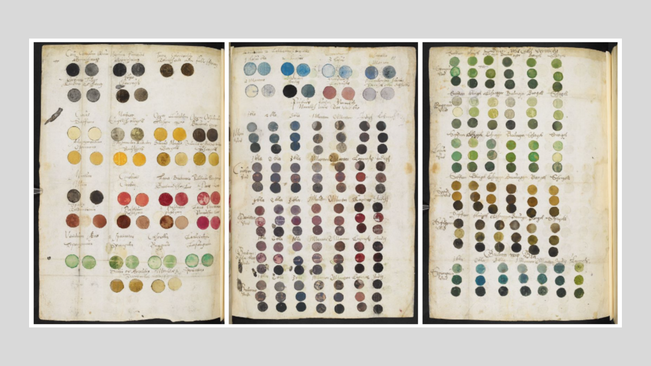
Figure 1. Color charts, Mayerne Manuscript, 1620-1646. (Images: British Museum).
Another early color chart was created by Richard Waller (d. 1715), an English naturalist, illustrator, and member and secretary of the Royal Society of London. Waller published his chart in 1686 and it served as a portable visual resource and chromatic lexicon for naturalists to identify and compare color nuances. The chart features color samples arrayed in columns, grouped by patterns of similarity, and accompanied by text notations indicating pigment name.
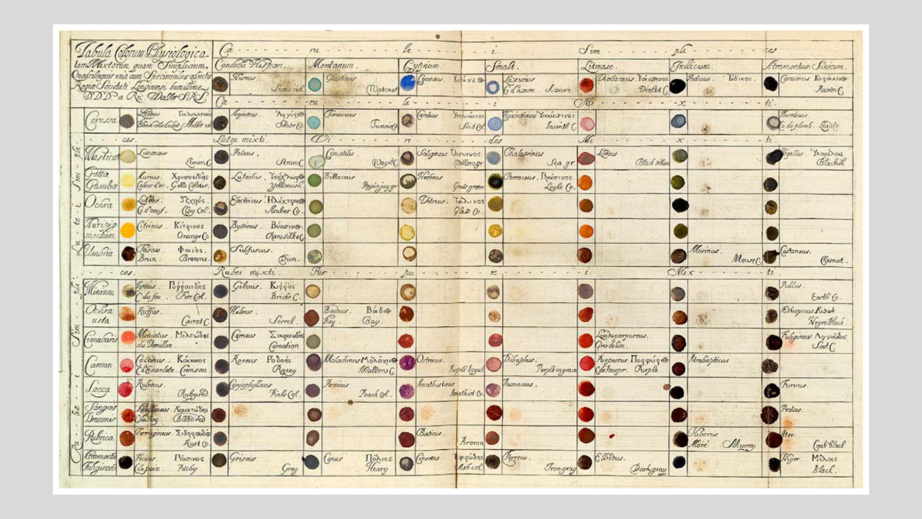
Figure 2. Waller’s color chart, 1686. (Image: Royal Society, London).
Little is known about the author A. Boogert and there is only one known copy of Traité des couleurs servant à la peinture à l’eau [Color qualities of watercolor paint]. Handwritten in Dutch, this book was intended as an educational guide, and it discusses the use of watercolor in painting. At a time when the watercolor palette was limited, this extraordinary book features 800+ handwritten and hand-painted pages, illustrating color variations that differ in hue, tonal value, and saturation.
Boogert’s book represents a precursor of modern color identification systems and anticipates the Pantone system by 300 years. The only known copy of this book is kept at the Bibliothèque Méjanes in Aix-en-Provence, France.
The hundreds of rectangular color samples are initially grouped by patterns of similarity such as red pigments, blue pigments and so on. Subsequent pages feature an individual pigment color (identified as ‘1’) with lighter (‘2’and ‘3’) and darker (‘4’ and ‘5’) variations. Color samples are identified via text notation and enumerated as above.
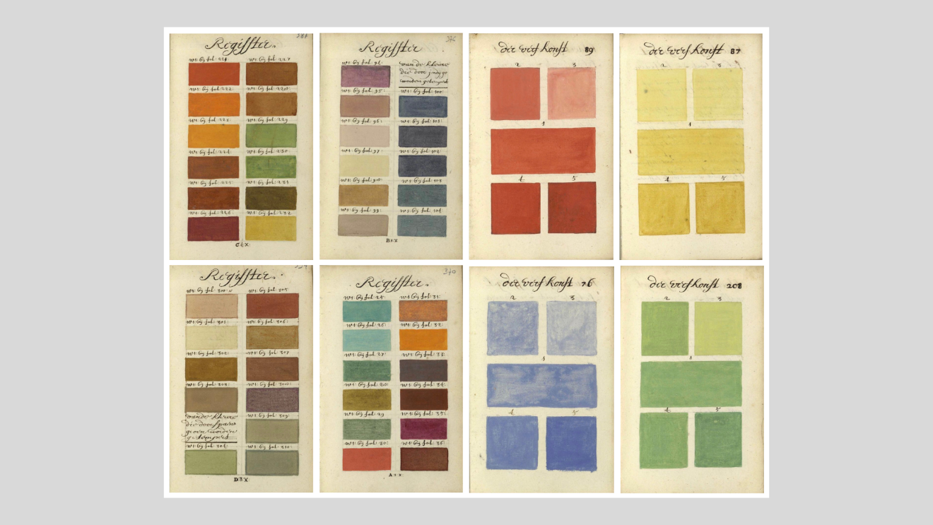
Figure 3. A selection of pages from Boogert's 1692 text. (Images: archive.org)
Jakob Christoph Le Blon’s text (1667-1741) foreshadowed the CMYK system which played a key role in printing in the 20th and 21st centuries. In Coloritto (1720), Le Blon made a clear distinction between pigment colors and color in the form of light and he foreshadowed “the foundation for modern color printing…[he] was the first to outline a three-color printing method using primary colors (red, yellow, blue) to create secondary colors (green, purple, orange) …Le Blon’s distinction marks the first documentation of what is now referred to as additive and subtractive color systems” (Smithsonian, 2017).
Le Blon is credited with inventing three and four-color mezzotint printing using separate metal plates for each color in 1715 (British Museum, 2020). The mezzotint (Italian for half tint or half tone) method involves the use of a metal (usually copper) plate that is textured with a tool called a rocker that creates thousands of small indentations. When the plate is inked, these indentations retain ink when the plate is wiped clean and the ink transfers to paper when paper is applied to the surface of the plate.
Le Blon’s plates bear no text or other identification. However, the British Museum has identified each as ‘progress proof, printed in yellow ink’, and so on.
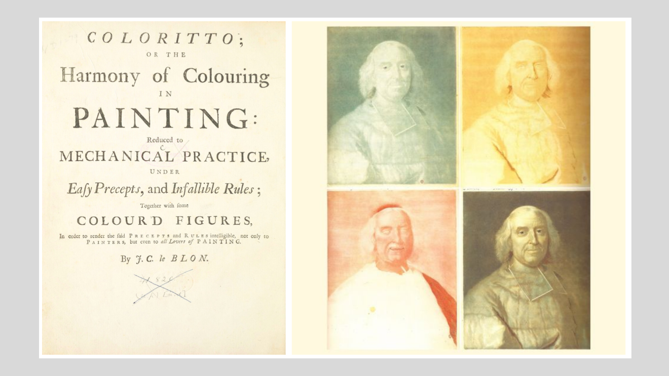
Figure 4. Le Blon’s 1720 title page and four-color prints. (Images: British Museum).
A note on the practical origins of ‘Additive’ and ‘Subtractive’ color
A further distinction between additive and subtractive color can be found in the practical processes involved in Mezzotint printing, which was invented by Ludwig Von Siegen (1609-1680) in 1642. Siegen worked from light to dark; that is, areas which he wanted to stay light in tone, were kept smooth, lacked indentations and were therefore unable to hold ink. When printed, these areas appeared “white” (that is, during the printing process, the lack of indentations left the area blank, unprinted). To create his imagery, Siegen added indentations (or some form of texture) which held ink and printed the darker tonal variations required to print imagery. This method was referred to as the ‘Additive method’; that is, adding areas that were to be printed in darker tones or black.
Le Blon invented three- and four-color mezzotints, using separate metal plates for each color. He printed from dark to light. That is, the whole plate was roughened with indentations and, if printed, the whole printed area would appear black (assuming the use of black ink). To create an image, a burnishing tool was used to smooth areas which did not hold ink and therefore printed lighter in tone or white (that is, the color of the paper). This mezzotint technique of working from dark to light was referred to as the ‘Subtractive method’ – starting with black and removing (subtracting) areas to achieve lighter tones and white. Le Blon’s use of the terms additive and subtractive led to the use of these in relation to color creation models. (Kuehni & Schwarz, 2008).
Schäffer (1769)
Jacob Christian Schäffer (1718-1790) was a professor and botanist with an interest in mycology, entomology, and ornithology. As well as developing taxonomies and classifications related to the natural world, Schäffer also developed simple color charts.
Schäffer published Entwurf einer allgemeinen Farbenverein in 1769 and its full title, ‘Plan for a universal relationship of colours; or research and model for determining and naming colours in a way that is useful to the general public’ indicates Schäffer’s intention of addressing “the lack of a totally exact and generally understandable determination and naming of colours” (Schäffer, 1769, p54). The aim of his text was clear: “whoever wants to describe an insect or whatever, can find its colour effortlessly in these colour charts and determine it accordingly” (Schäffer, 1769, p54).
Schäffer’s text features a frontispiece plate that illustrates seven key colors clustered according to hue family. Specifically, red, yellow, and blue are depicted on a larger scale and centrally placed with green and brown to the left, and white and black to the right. Plate II of Schäffer’s text features a full-page chart of red hues. The red color chart features enumerations alongside empty sample spaces indicating that the chart is incomplete, especially as only one of Schäffer’s seven key colors is featured in the form of a chart of color samples in the text.
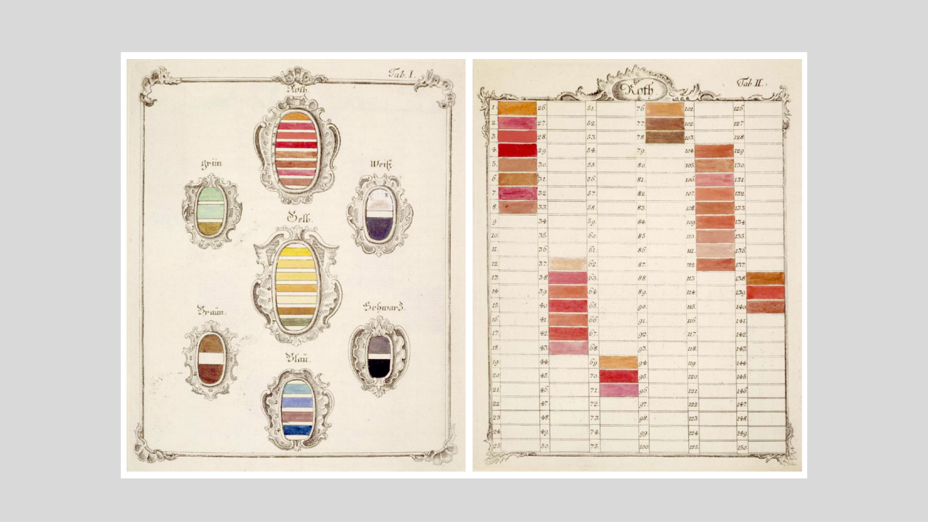
Figure 5. Color charts from Schäffer, 1769. (Images: Gutenberg-e.org)
German astronomer and mapmaker, (Johann) Tobias Mayer (1723-1762) is credited with conceptualising the first color solid based on substance (pigment) color which also featured a color notation system. In 1758, Mayer presented a lecture to the Göttingen Academy of Science entitled, 'De affinitate colorum commentatio'. Mayer aimed to identify the number of colors which the eye is capable of perceiving, and he used the artist’s palette of red (rot), yellow (gleb), and blue (blau) as his basic colors. Mayer considered black and white to be the media of light and darkness, and these were used these to lighten or darken colors. Mayer (1775) referred to three key hues as follows:
There are three simple or basic colors and no more than that, all others can be generated from their mixture; they themselves cannot be generated in any way from others, in whatever ration they might be mixed: red, yellow and blue. We see them in rainbows, but even more distinctly in rays of the sun captured by a glass prism, though they are accompanied by secondary colors.
In Mayer’s 1775 manuscript, he provided a visualization of his color model and devised a way of notating colors using 12 steps between each of the three hues plus 12 steps from white to black. Mayer’s rationale for this number related to achieving an adequate visual differentiation between color nuances as well as proportions in both architecture and music. Mayer located the three key hues at the corner of an equilateral triangle and envisioned a three-dimensional color model that featured white at the apex and black at the nadir (Kuehni & Schwarz, 2008).
Georg Lichtenberg’s 1775 translation of Mayer’s text, slimmed Mayer’s color solid down to seven gradations per side. Mayer’s triangle’s central block had an exactly equal proportion of red, yellow, and blue (r4y4b4, in Mayer’s notation).
Mayer’s color model added a black-and-white axis to this mix, showing how systematic additions of these colors brightened or darkened colors. Subsequently, Jacques Lacombe created a 12-step version of Mayer’s conceptual color triangle which was re-created by Mauricio Lucioni in 2017.
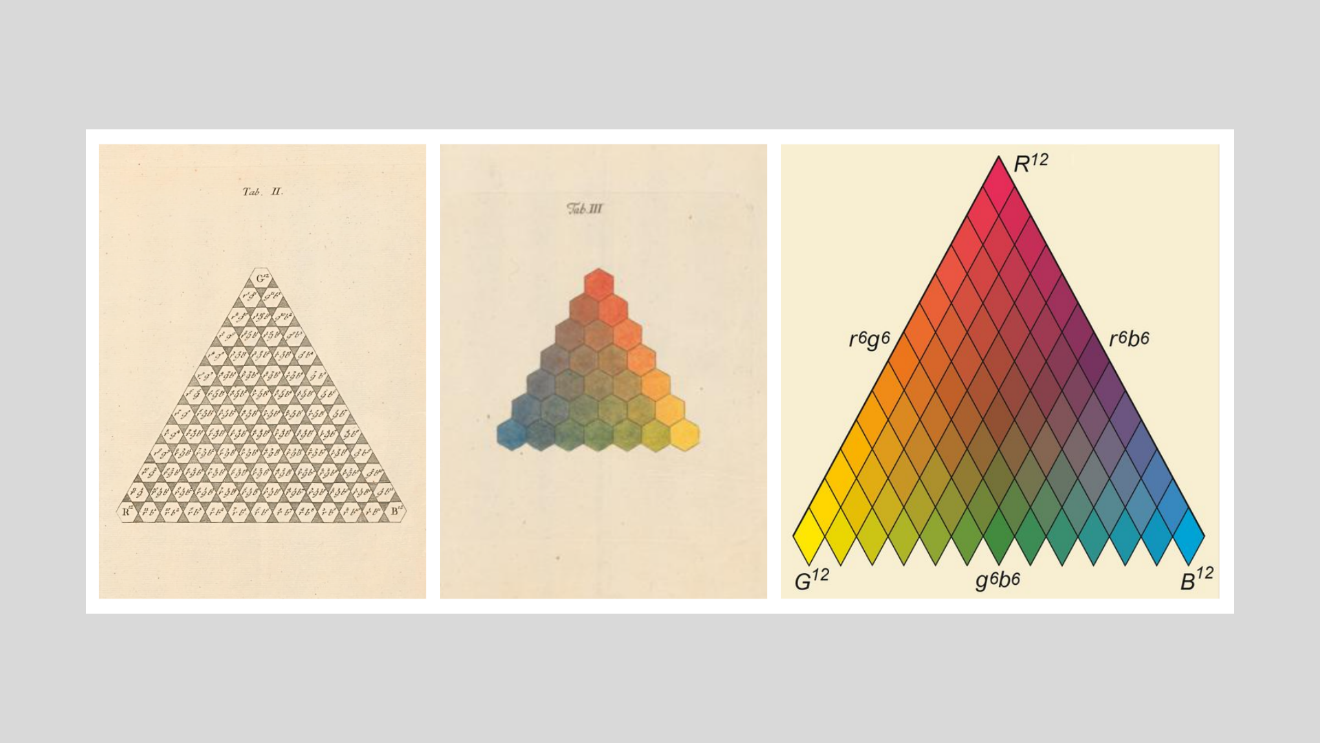
Figure 6. Illustrations of Tobias Mayer’s color system. (Images: e-rara.ch and and Mauricio Lucioni, Wikimedia Commons).
Bauer/Haenke color charts (1789-1793)
Ferdinand Bauer (1760-1826) was an Austrian botanical artists born in Feldsberg, now Valtice in the Czech Republic. Ferdinand was a botanical illustrator with exceptional skill as a draughtsman and colorist. He used a unique, color-by-numbers technique that allowed him to sketch flora and fauna while in the field and code each color area which he then used to create highly detailed botanical illustrations.
Bauer accompanied Oxford University Professor John Sibthorp to Greece and Asia Minor, and created 1,500 sketches of flora, fauna and landscapes, many of which appeared in Flora Graeca, referred to as "the greatest botanical work that has ever appeared". Bauer was selected by Sir Joseph Banks to accompany Matthew Flinders on the first circumnavigation of Australia, 1801-1803 to create botanical illustrations.
Bauer created color charts featuring up to 1,000 colors which he used for his color-coded sketches. Bauer’s color charts are now lost but Czech botanist and explorer, Thaddäus (Tadao) Haenke (1761-1816) was given one of his charts in 1786 and extended it for his own use. This color chart is kept at the Royal Botanic Garden Madrid along with other charts that Haenke developed (Mabberley & Pio Aladren, 2012).
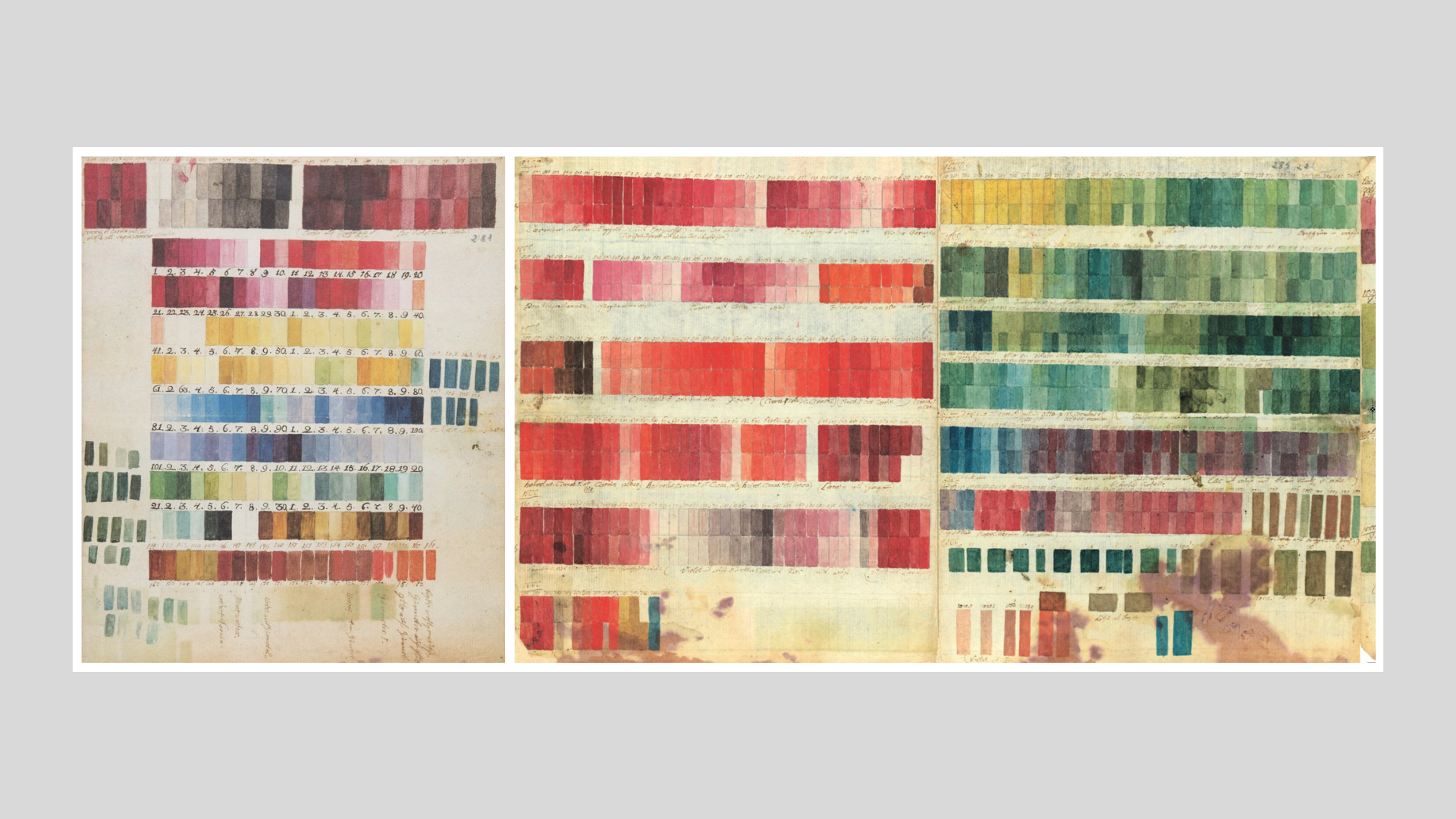
Figure 7. Color charts, Bauer and Haenke, 1789-1793. (Images: Real Jardın Botanico).
Schönfeld
Johann Ferdinand Ritter von Schönfeld (1750-1821) was a Czech printer, publisher, book seller, and art collector and patron. He published the 'Wiener Farbenkabinet' in 1794, an extraordinary text that discusses color applications and features thousands of hand-painted color samples.
Published well before the discovery of synthetic dyes in the mid-1850s, the text features Schönfeld’s system of named, calibrated, and numerated color samples. Only three copies of the text exist – the Smithsonian Institution copy features 2,592 color samples; the Yale copy features 3,792 color samples and the Princeton copy, 4,608 color samples.
The description for the Princeton copy notes the text features 14 prose sections that focus on seven individual colors at length (white, black, blue, yellow, red, green, and brown) plus various topics including watercolors, miniature painting, colorist’s techniques, landscapes, and clothing. Schönfeld also discusses details about color across a wide range of applications plus he includes notes on printing inks and papers used by book printers and binders.
Schönfeld’s text is notable because it is visually very similar to twentieth century color systems in terms of the comprehensive nature of its color sample range and its layout. As the Cooper Hewett Smithsonian Design Museum notes, “Before Pantone, there was the Wiener Farbenkabinet” when the Museum featured Schönfeld’s text in the exhibition Saturated: The Allure and Science of Color (May 11, 2018-January 13, 2019).
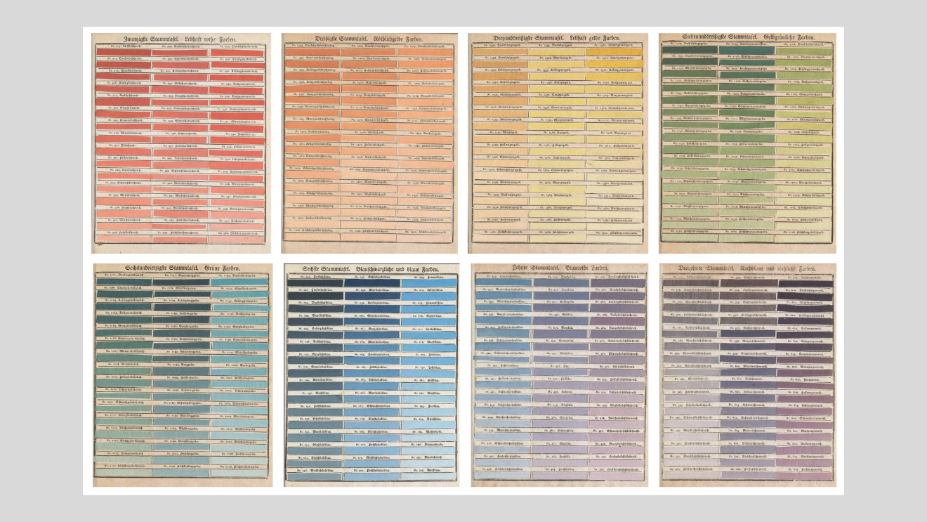
Figure 8. Pages from Schönfeld’s 'Wiener Farbenkabinet'. (Images: archive.org).
In the eighteenth century, mineralogist Abraham Gottlob Werner (1749-1817) devised a standardized color scheme that allowed him to describe subtle chromatic differences with consistent terminology. His scheme was then adapted by an Edinburgh flower painter, Patrick Syme, who used the actual minerals described by Werner to create the color charts in the book, enhancing them with examples from flora and fauna.
Werner's handbook features 110 colors clustered by hue family across thirteen pages with each color numbered and named according to their pigment color. The text became an invaluable resource for naturalists and anthropologists, including Charles Darwin who used it to identify colors in nature during his voyages on the HMS Beagle (1831-1836).
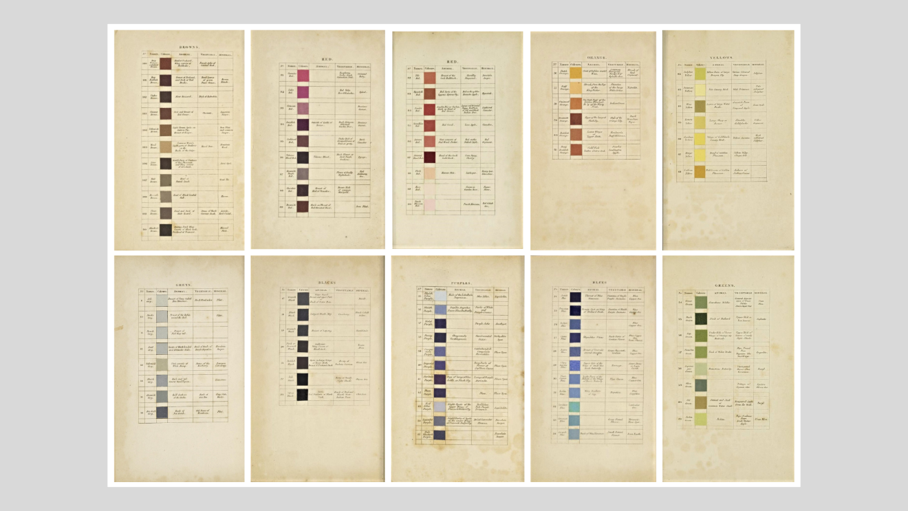
Figure 9. Pages from Werner's nomenclature of colors, 1821 (Images: archive.org).
In 'Theorie des couleurs: Contenant explication de la table des couleurs', Gaspard Grégoire (1751–1846) mathematically calculated a highly practical color order system. Kuehni (2008) suggests that Grégoire anticipated the Munsell color system by a century and Grégoire identified and illustrated three color attributes: hue, value, and chroma. Grégoire specifically created value scale charts to illustrate tonal value clusters and used terms from music theory to describe value clusters – chords, notes, and scales.
Kuehni notes, "The new, and important point is that the lightness of all the samples on the hue circle is adjusted (by Grégoire’s eye) to equal that of the middle gray illustrated below it. Hues are defined by number (1-24), chromatic intensity from 1 (highest chroma) to 9 (achromatic), and lightness (ton or nuance) by a number from 1 (lightest color) to 7 (black). Grégoire was also the first to implement a three-dimensional object color system based on these attributes (Kuehni, 2008, p7).
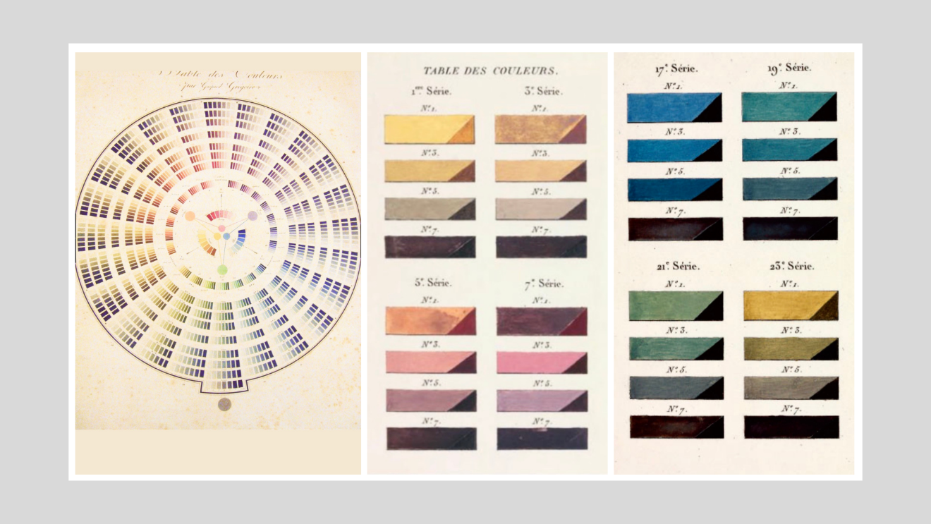
Figure 10. Color illustrations and tables, Grégoire, 1820. (Images: Gallica, BNF).
John Franklin Earhart (1853-1938) was born near Columbus, Ohio and as a young man he worked in the printing department of the Ohio State Journal. He joined the University of Cincinnati in 1925 and taught color theory until his retirement. Noted for his innovations and insight in respect to printing techniques, Earhart incorporated the Earhart Printing Company in 1883 and between 1888-1892, formed the firm of Earhart and Richardson, the publishers of ‘The Color Printer’. Earhart also joined the University of Cincinnati in 1925 and taught color theory there until his retirement.
Prior to the emergence of CMYK color in the printing industry, Earhart provides insight into the printing of colored images and ‘The Color Printer’ was intended as a “practical guide to all printers who desire to obtain the most artistic results in ornamental Color Printing, by the least amount of labor and expense” (Earhart, 1892, preface).
Earhart notes that there are three primary colors: red, yellow, and blue. However, for the purpose of printing, Earhart provides twelve colors which deliver the greatest range of colors for printing, as follows. The first three colors are the primaries—red, yellow, and blue. Then follows the three secondaries—orange, green, and purple. Then follows deep blue, rose lake, lemon yellow, vermilion, gray, and black. Purple was selected instead of violet, as one of the secondary colors, because it lies about half way between the red and blue, while the violet is a little too near the blue. One of the main objects in making this selection of colors, was to have them as far removed from one another as possible, so that we could get a greater variety of mixed colors (p14).
Earhart’s text features a single page of twelve key colors used in printing followed by eighteen pages of color samples (144 in total) created using the twelve key colors plus another ten pages of color samples (300 in total).
In addition to color charts, Earhart provides detailed descriptions of color strategies for printing purposes plus numerous tips on using color and contrast for effective printed outcomes across all types of applications including signage, promotional collateral, packaging, labels and so on. The text also discusses contrast and simultaneous contrast plus issues that can arise in respect to these within the context of printed color.
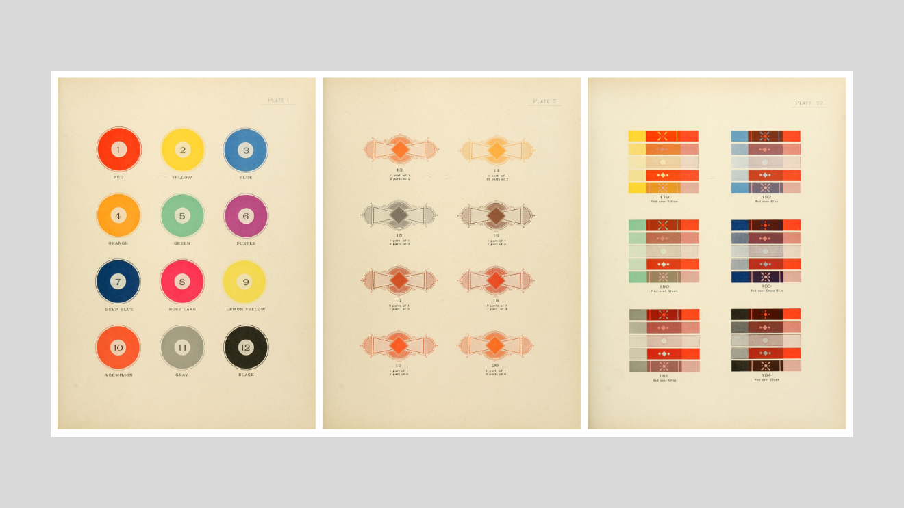
Figure 11. A selection of pages from Earhart, 1892. (Images: archive.org).
Chevreul (1839, 1855, 1857, 1864)
French chemist and dye master Michel Eugène Chevreul (1786-1889) focused on color relationships and color interactions primarily due to his work at the Manufacture des Gobelins in Paris where he was director of the dye department.
Chevreul’s knowledge about color appearance, the ways colors interact as well as how they influence the perception of contiguous colors occurred through his observations of color in dyeing and woven textiles. Chevreul published several texts, some of which relate to color and the most notable of these is, ‘The principles of harmony and the contrast of colors and their applications to the arts’ (1839).
Chevreul’s ideas were underpinned by the notion of ‘simple’ or primary colors (red, blue, and yellow), and that orange, green, indigo, and violet are secondary or compound colors. Chevreul described in detail the ways in which these simple and compound colors could be combined to create a multitude of color nuances using dyes (Chevreul, 1839; 1855; 1857). His theories about complementary color influenced many Impressionist painters although this influence was tempered by Chevreul’s focus on the notion of color harmony. In this context, painters tend to prefer to express their own ideas about color harmony and rejected or ignored Chevreul’s theories on this subject (Roque, 2011). Like many color theorists, Chevreul attempted to combine or conflate theories of color and theories of colored light, and he confused the mixture of pigments and the mixture of lights. As a result, Chevreul’s publications attracted criticism (Roque, 2011).
Chevreul came to be highly influential because of his extensive knowledge of color plus his ideas about simultaneous contrast and the capacity of this effect to enhance color strategies in art and design, plus his practical recommendations regarding the ways to avoid or counteract the impact, if required in art and applied design. In respect to the impact of simultaneous contrast, Chevreul was asked to testify as an expert witness in a court case between a wallpaper manufacturer and an industrialist client for whom wallpaper had been made. The issue focused on a wallpaper with a grey pattern on a green background. Due to the influence of simultaneous contrast, the grey patter appeared reddish, and the client refused to pay the manufacturer. Chevreul was able to demonstrate that the grey color was as per the specified grey but appeared reddish due to the influence of the green background. In addition, Chevreul provided a solution which involved adding a small amount of the background green color to the grey to counteract the simultaneous contrast effect (Roque, 2011).
In Des couleurs (1864), Chevreul presented his color classification system which distinguishes 1,440 color nuances. The book’s illustrations were produced in collaboration with René Henri Digeon by means of “chromochalcography,” an intaglio color printing technique that involved multiple steel printing plates.
Chevreul’s extraordinary text featured twelve color circles that ranged from an entirely contiguous array of colors without any distinguishable division between color nuances through to a full saturation version (with divisions between color nuances) plus a series of nine desaturated color circles. Chevreul’s color charts also featured twelve steps of tonal value variations. Chevreul clearly distinguished between variations in hue, saturation and tonal values, providing an invaluable color data resource for painters, dyers, and those involved with color application.
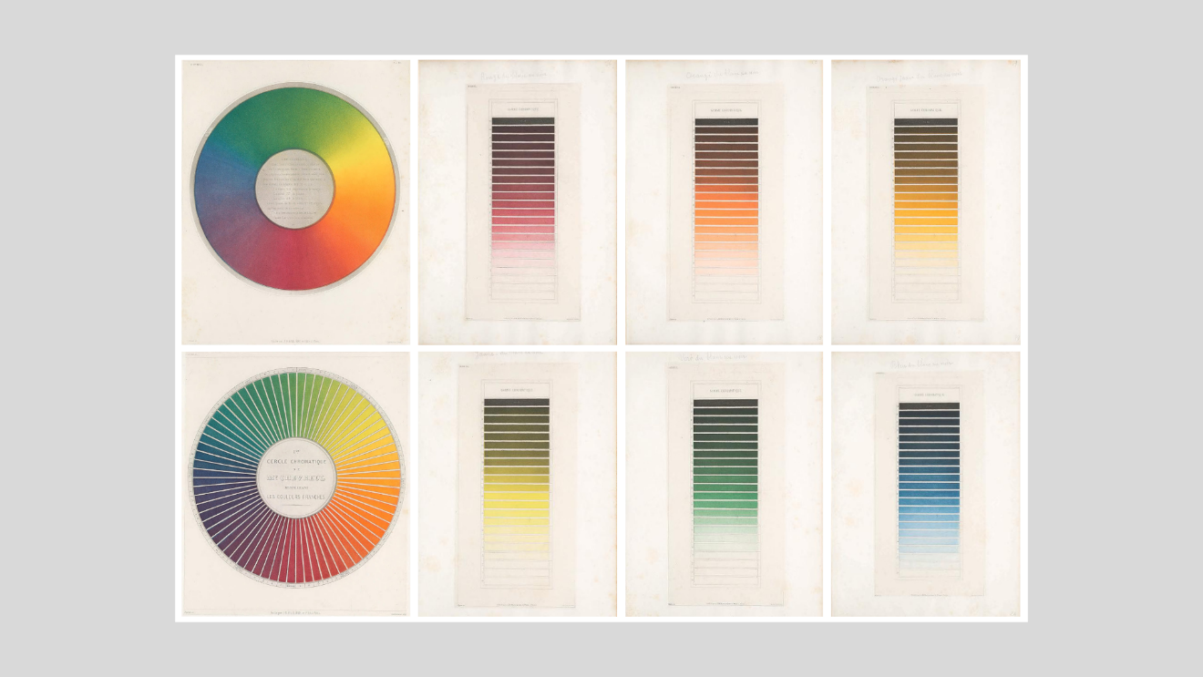
Figure 12. A small selection of pages from Chevreul, 1864 (Images: archive.org.
Benson (1871)
English architect, William Benson aimed to link his color science model based on the RGB triad with applications within the decorative arts; however, he failed to achieve this aim primarily because of the focus on the science of color and lack of practical insight into color application in the decorative arts.
In 'The Principles of the Science of Colour, concisely stated to aid and promote their useful applications in the Decorative Arts', Benson focused on the RGB colour model, and proposes a simple system of color based on “the true theory of the three elementary [RGB] color-sensations (Benson, 1868, pvi).
Benson provides nil practical information about colour application for the decorative arts beyond his highly prescriptive, constructed link between the creation of neutral grey in the eye and colour harmony. In this respect, Benson suggests the aim is to apply colour combinations in such a way that the resulting vibrations “should neutralize each other” and produce a neutral gray in the eye. “The colours of each section should produce if mixed its central [gray] colour. Those of each pair of sections equidistant from a medial section, as well as those in each whole set, should perfectly balance each other, producing, if mixed, the central Gray. Those of the three corresponding sections of any of the cognate sets should also neutralize each other” (p40). Benson makes no mention of the impact of contextual and cognitive factors or evaluative responses, and only focuses on this assumed physical, visual response.
Benson’s color model and charts are interesting; however, he did not provide a color system that had practical value for those involved in applied design and design of the built environment.
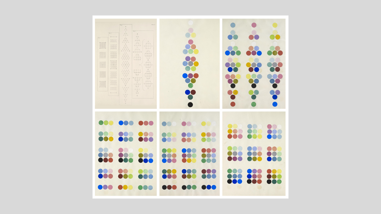
Figure 13. Pages from Benson, 1868 (Images: archive.org).
Ridgway’s Nomenclature of colors (1886, 1912)
Robert Ridgway (1850-1929) was an American ornithologist who was appointed in 1880 by the secretary of the Smithsonian Institution to be the first full-time curator of birds at the United States National Museum.
Ridgway published multiple texts including two that related specifically to color with the aim to create "a nomenclature of colors and a compendious dictionary of technical terms used in descriptive ornithology, together with a series of plates or diagrams illustrating the external anatomy of a bird in relation to the terms employed, and such other things as are more clearly expressed by a picture than by a mere definition” (p14).
In creating his nomenclature, Ridgway included multiple pages devoted to lists of pigment colors including a vocabulary of color names in English, Latin, German, French, Spanish, Italian, Norwegian and Danish plus multiple pages of technical information. In addition, Ridgway’s text features ten color illustrations plus directions to create specified pigment colors, such as "Indigo blue . . . Antwerp blue + black" (Ridgway, Plate XI). Colors in the text are variable in quality and vary across different editions of the same text.
Ridgway’s self-published ‘Color standards and color nomenclature’ (1912) became a highly influential, reliable, and widely used color reference for good reason. The text featured 1,115 colors illustrated via twenty-seven painted samples on 53 plates. Ridgway notes, "In the present work the possibility of variation between different copies is wholly eliminated ... Each color, for the entire edition, is painted uniformly on large sheets of paper from a single mixture of pigments, these sheets being then cut into small squares which represent the colors on the plates" (Ridgway, 1912, p13). The text presents as an excellent color standard manual due to its quality of production, thanks to the entrepreneurial Ridgway.
In Ridgway’s text, colors are clustered by hue similarity and each page features variations in tone and saturation of each hue in an orderly layout accompanied by color pigment name.
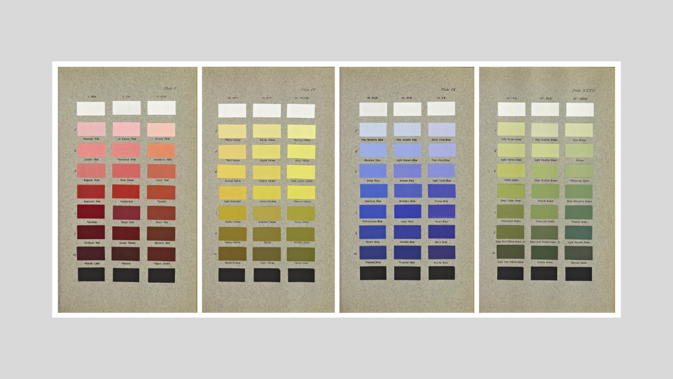
Figure 14. Four pages from Ridgway, 1912 (Images: archive.org).
Charles Lacouture (1832-1908) was a French botanist who taught natural sciences at Saint-Clément college in Metz and then Dijon (Kuehni & Schwarz, 2008). His color theories focused on color in the form of pigments and he, like many contemporaries, attempted to align his color theories with those that related to color in the form of light-waves.
In his key text, Répertoire chromatique (1890), which he dedicates to Michel-Eugène Chevreul, Lacouture’s aims were to establish a nomenclature and color theory based on his observations with color application and identify typical color ranges via simple illustrations and color charts, the latter colored via chromolithography. Lacouture’s ‘Rose synoptique’ hue circle includes three key colors (red, yellow and blue) interspersed with three intermixed colors between each key color plus three shades and three tints of all twelve colors. Lacouture doesn’t refer to ‘primary colors’ and auxiliary or ‘secondary colors’; instead, he refers to ‘couleurs primitives et couleurs dérivées’. Lacouture’s three primitive colors are red (R), yellow (J) and blue (B).
A detailed text, Lacouture devotes a considerable amount of content to the mathematically described outcomes of color mixing using three primitive colors (plus black and white), plus color nuances achieved through intermixture of red, yellow, and blue. The quality of the colors depicted in the Atlas, which features 29 chromolithographs by Guillaume Severeyns, differs considerably among different editions of the same text. Lacouture’s diagrams feature twelve key colors are broken down into variations of tonal value and saturation as well as intermixed color nuances clearly illustrated and enumerated.
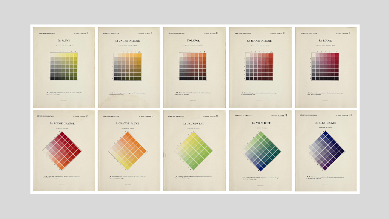
Figure 15. Pages of color samples from Lacouture, 1890. (Images: archive.org).
Leidel (1893)
Henry Leidel’s book includes detailed instructions regarding 175 color pigments plus 175 color samples. Leidel suggest that there are three classes of colors: Primary, Secondary & Tertiary; the latter composed of two Secondary or three Primary Colours.
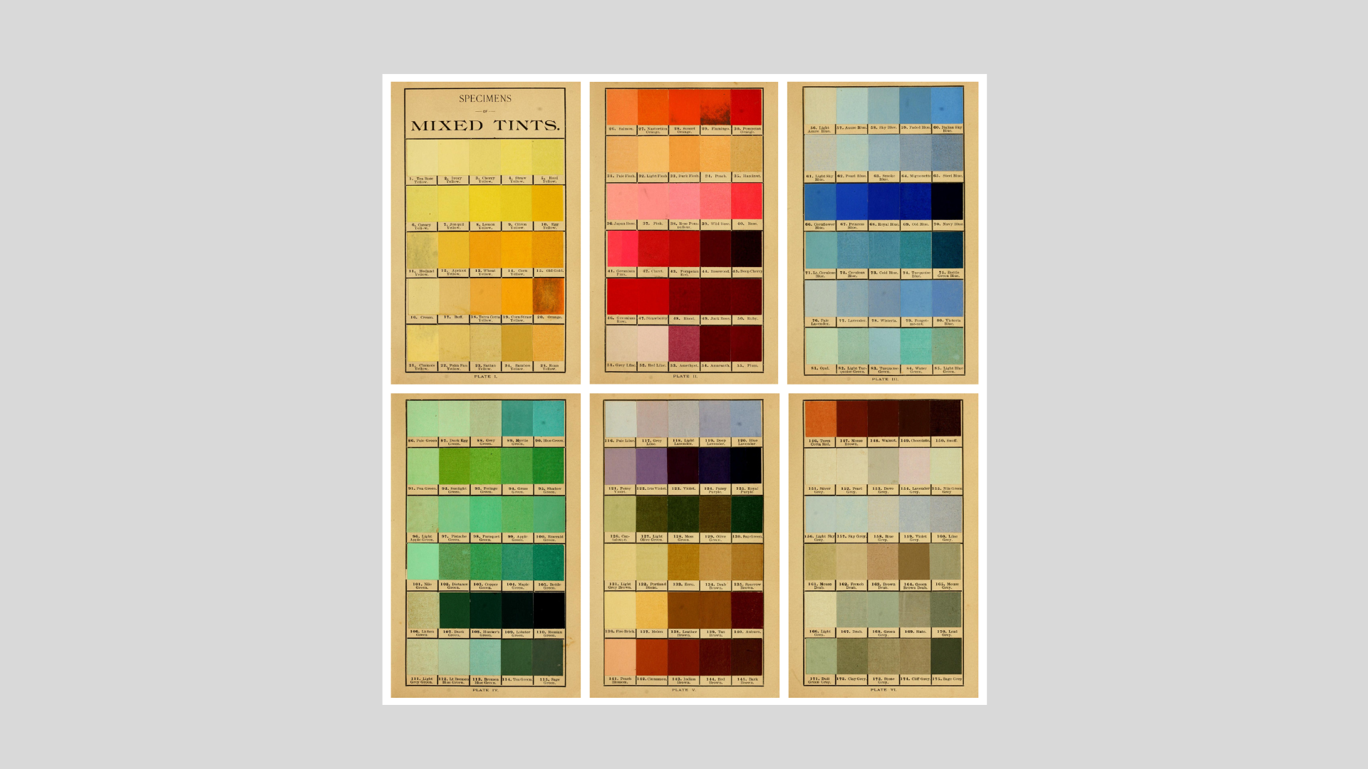
Figure 16. Pages from Leidel, 1893. (Images: archive.org).
Conclusion
Early color charts and notation systems provided a basis from which twentieth century color systems such as the Ostwald, Munsell, NCS, RAL, and Pantone systems evolved. The early systems generally emerged from within a particular area of activity such as naturalism, painting, philately, or dyeing and were relevant within that realm. However, their emergence had broader interest and appeal to others who may have been involved in color application.
The developments and industrial advances wrought by the Industrial Revolution such as mass production placed greater emphasis on developing ways to identify and communicate color data across different applications from design ideation through to finished product to ensure that color application aims matched intended outcomes. This issue became imperative especially for those who worked in applied design and design of the built environment.
A further discussion about color notation systems in the twentieth century and beyond describes how design professionals illustrated their design concepts using gouache paint and the like, and required the means to translate their intended color schemes into colors that could be easily replicated in the manufacture and production of applied design as well as design of the built environment. Hence, systems like NCS and Pantone proved to be invaluable color resources that designers and architects could use to identify the color schemes in their projects.
Updated June 10, 2023 © Zena O'Connor, Design Research Associates - https://zenaoconnor.com/
References
Benson, W. The Principles of the Science of Colour, concisely stated to aid and promote their useful applications in the Decorative Arts. London: Chapman and Hall; 1868. Accessed March 12, 2023, from https://archive.org/details/gri_c00033125008694651/
Boogert, A. (1692). Traité des couleurs servant à la peinture à l’eau [Color qualities of watercolor paint]. Place of publication and publisher not known. Accessed on January 21, 2023, from https://archive.org/details/boogert1692traitedescouleursbmejanes/
Chevreul, M.E. (1839). De la loi du contraste simultané des couleurs. Paris: Chez Pitois-Levrault et cie. Accessed March 2, 2023, from https://archive.org/details/Delaloiducontra00Chev/
Chevreul, M. E. (1855). The principles of harmony and the contrast of colors and their applications to the arts (English trans. Charles Martel). London: Longman, Brown, Green and Longmans. Accessed March 2, 2023, from https://archive.org/details/principlesharmo00martgoog/
Chevreul, M. E. (1857). The laws of contrast of color and their applications to the arts (English trans. J. Spanton). London: G. Routledge and Co. Accessed March 2, 2023, from https://archive.org/details/lawscontrastcol01chevgoog/
Chevreul, M. E. (1861). The laws of contrast of color and their applications to the arts (English trans. J. Spanton). London: G. Routledge and Co. [This text features better illustrations] Accessed March 2, 2023, from https://archive.org/details/lawsofcontrastof00chev/
Chevreul, M.E. (1864). Des couleurs et de leurs applications aux arts industriels à l'aide des cercles chromatiques. Paris: J.B. Ballière et fils. [Title page lists the author as E. Chevreul with engravings by René Henri Digeon who used the aquatint process with separate plates for yellow, blue, red and black]. Accessed April 10, 2023, from https://archive.org/details/gri_c00033125008481489
Chevreul, M.E. (1864). Des couleurs et de leurs applications aux arts industriels à l'aide des cercles chromatiques. Paris: J.B. Ballière et fils. [High resolution images can be downloaded separately to text]. Accessed April 10, 2023 from https://library.si.edu/digital-library/book/descouleursetde00chev and https://www.cooperhewitt.org/2018/05/21/maximum-chroma/
Earhart, J.F. (1892). The color printer: a treatise on the use of colors in typographic printing. Cincinnati: Earhart & Richardson. Accessed March 6, 2023, from https://archive.org/details/colorprintertrea00earh/
Grégoire, G. (18200; 4 editions published between 1790 and 1839). Théorie des couleurs, contenant explication de la Table des couleurs. Paris: Chez l'Auteur et Chez Brunot-Labbe. https://gallica.bnf.fr/ark:/12148/bpt6k8561528
Kuehni, R.G. (2008), Forgotten pioneers of color order. Part I: Gaspard Grégoire (1751–1846). Color Research and Application, 33 (1), 5-9. https://doi.org/10.1002/col.20362
Kuehni, R. G. & Schwarz, A. (2008). Color ordered: A survey of color order systems from antiquity to the present. Oxford: Oxford University Press.
Lacouture, C. (1890). Répertoire chromatique: Solution raisonnée et pratique des problèmes les plus usuels dans l'étude et l'emploi des couleurs. Accessed June 10, 2020, from https://archive.org/details/gri_33125012875395/
Le Blon, J.C. (1720). Coloritto, or, The harmony of coloring in painting : reduced to mechanical practice, under easy precepts and infallible rules, together with some color'd figures, in order to render the said precepts and rules intelligible not only to painters, but even to all lovers of painting. [London : s.n.]. Accessed May 26, 2020, from https://archive.org/details/Colorittoharmon00LeBl/
Le Blon image credit: British Museum. Accessed May 26, 2020, from https://www.britishmuseum.org/collection/term/BIOG35081
Le Blon image credit: British Museum. Accessed May 26, 2020, from https://www.britishmuseum.org/collection/term/BIOG35081
Leidel, H. (1893). Hints on tints and how to mix them: illustrated by one hundred and seventy-five specimens of tints, with an introductory essay on color and colors. New York: H. Leidel. https://archive.org/
Mayer, J. T. [Johann Tobiae Mayeri]. (1775). Opera inedita / edidit et observationum appendicem adiecit Georgius Christophorus Lichtenberg. V. 1, Commentationes Societati Regiae Scientiarum oblatas, quae integrae supersunt, cum tabula selenographica complectens. Göttingen: Johann Christian Dieterich. Accessed April 20, 2023, from https://www.e-rara.ch/zut/doi/10.3931/e-rara-8854
Mayerne, T. T. (1620-1646). Pictoria Sculptoria et quae subalternarum artium (Painting, Sculpture and of the Lesser Arts). Manuscript in Latin, English, French, Italian, and German with contributions by Edward Norgate, Samuel Cooper, Paul van Somers, Peter Paul Rubens, Anthony van Dyck, among others. Fol. No. XIX. Sloan 2052, British Museum, London. Accessed February 18, 2023, from https://www.bl.uk/manuscripts/FullDisplay.aspx?ref=Sloane_MS_2052
Nemcsics, A. & Caivano, J.L. (2015). Color Order Systems. In: Luo, R. (eds) Encyclopedia of Color Science and Technology. Springer, Berlin, Heidelberg. https://doi.org/10.1007/978-3-642-27851-8_232-7
Nickelsen, K. (2006) The Challenge of Colour: Eighteenth-Century Botanists and the Hand-Colouring of Illustrations, Annals of Science, 63:1, 3-23, DOI: 10.1080/00033790500151177
Ridgway, R. A. (1886). Nomenclature of colors for naturalists and compendium of useful knowledge for ornithologists. Boston: Little Brown & Company. Accessed March 15, 2023, from https://archive.org/details/nomenclatureofc00ridg/
Schäffer, J. C. (1769). Entwurf einer allgemeinen Farbenverein oder Versuch und Muster einer gemeinnutzlichen Bestimmung und Benennung der Farben. Regensburg: Gedruckt bey Emanuel Adam Weiss. Accessed March 18, 2023, from https://pbc.gda.pl/dlibra/publication/877/edition/2772 and http://www.gutenberg-e.org/lowengard/C_Chap06.html
Schönfeld, J. F. R. (1794). Wiener Farbenkabinet : oder, vollständiges Musterbuch aller Natur= Grund= und Zusammensetzungsfarben [Viennese Color Collection or Complete Book of Samples of all Natural, Basic, and Combined Colors]. Wien und Prag: Verlag der Schönfeldschen Handlung. Accessed on March 29, 2023, from https://archive.org/details/WienerFarbenkab00/
Smithsonian (2017). The science of color. Accessed May 26, 2020, from https://library.si.edu/exhibition/color-in-a-new-light/science
Waller, R. (1686). A catalogue of simple and mixt colors with a sample of each color. Philosophical transactions of the Royal Society of London, Vol XVI, pp24-32, 1686-1687. London: Royal Society of London. Accessed March 20, 2023, from https://archive.org/details/Philosophicaltr16Roya/ and https://royalsocietypublishing.org/doi/pdf/10.1098/rstl.1686.0005
Warhurst, B. W. (1899). A colour dictionary giving about two hundred names of colours used in printing. London: S. Gibbons.
Werner, A. G. (1821). Werner's nomenclature of colors : with additions, arranged so as to render it highly useful to the arts and sciences, particularly zoology, botany, chemistry, mineralogy, and morbid anatomy : annexed to which are examples selected from well-known objects in the animal, vegetable, and mineral kingdoms. Edinburgh: Printed for William Blackwood, Edinburgh, and T. Cadell, Strand, London. Accessed March 12, 2023, from https://archive.org/details/gri_c00033125012743312/
Werner – A beautiful pocket-size facsimile published by Smithsonian Books is available online https://smithsonianbooks.com/store/science-nature/werners-nomenclature-of-colors-adapted-to-zoology-botany-chemistry-mineralogy-anatomy-and-the-arts/
Werner’s original text plus a poster has been meticulously re-created by Chicago-based designer and data artist Nicholas Rougeux. See also Instagram @nicholasrougex and Twitter @rougex https://www.c82.net/werner/
About the author - Dr Zena O’Connor established Design Research Associates in 2006 and has focussed on evidence-based color strategies, insight, and recommendations for applied design and the built environment. Zena has completed numerous color design projects across commercial, residential and the healthcare and aged care sectors. A designer by training, Zena’s PhD research investigated color in the built environment (Faculty of Architecture, Design & Planning, University of Sydney). She has developed and taught university courses (Sydney University, University of NSW and Sydney Design School) and published 70+ peer-reviewed academic articles on color in applied design and the built environment. https://zenaoconnor.com